Streamlining Navigation Design for More Intuitive User Experience

Citizens Wealth team wanted to engage more web & mobile visitors and existing customers by targeting them with trending topics and helpful resources, with the end goal of generating more traffic and leads.
THE PROBLEM
- UX Research indicated Wealth customers were seeking timely information as was being offered by the Wealth team but were unable to find it using the current navigation architecture.
- Historic low engagement rates with the current navigation indicated the navigation taxonomy wasn’t serving customer needs.
- There wasn’t a dedicated area or “Knowledge Center” where to offer Wealth clients personalized content & resources.
- Platform visitors were faced with a navigation bar with many options, forcing them to read all of them in search for their interest area.
THE SOLUTION
- Keep It Simple: Redesign navigation with better labeling & taxonomy for transparency.
- Consider User Intent: Reconstruct the navigation strategically, to allow users to easily find what they need and complete their actions.
- Optimize for Search Engines: Provide an intuitive and streamlined navigation UX design for easier search function.
- Have Data Drive Decision: Utilize analytics to better understand user behavior using data.
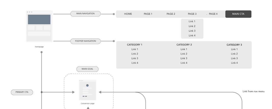
THE SOLUTION JOURNEY Step One: Recrafting Information Architecture
As the Information Architect on the UX team I provided the right mix of advocacy, guidance and UX strategy in terms of best practices for taxonomy for better transparency and engagement. Business recognized that organizing your website navigation and sub-navigations needed to start with Information Architecture.
Specifically, I:
- Collaborated with the product manager, designers, engineers, and stakeholders to define the IA of the website and related app.
- Conducted A/B testing to identify better labeling for the new “Knowledge Center”. Using those test results to determine which labels would work best.
- Reviewed & enhanced current site taxonomies to keep track of how we historically categorized various content and identified areas of improvement, then tagged the material with metadata so that people can look for it through assumed taxonomies.
- Utilized search systems and user-centered design to address user needs. And helped guide users to ideal content search, through content labeling and metadata, as part of pages’ HTML.
- Optimized text labels. By removing long texts in navigation bar labels, I sought to decrease the user’s time needed to process the information which could lead to prolonged decision making.
Information Architecture helped us reimagine our navigation bar by helping us understand the power of labels.
Step Two: Redesigning Navigation
As the Information Architect on the UX team I provided the right mix of advocacy, guidance and UX strategy in terms of best practices for navigation redesign for better transparency and engagement.
Specifically, I:
- Organized sub-navigation structures and features around relevant content. Taking both mobile and desktop designs into account.
- Applied a hierarchy to the navigation by grouping information together in the order of importance to the users, identified by UX Research.
- Created a balance directing users to pages they like while leading them to pages that are fundamental to business goals.
- Replaced drop-down menus with mega drop-down menus. UX research showed that the “mega menu” performed well in usability studies. This provided a very large drop down with lots of elements, almost like a mini site map.
- Identified organized content types representing user demands, and adhere to tech requirements, in collaboration with our dev team.
FINAL RESULTS
The Wealth navigation bar redesign driven by Information Architecture has been one of the most successful redesign efforts the business team has seen. Customer feedback has been positive and monthly visits from the home page have increased several percentage points.