Writing Effective Error Messages
UX Error Messages - What are they?
Definition: An error message is a system-generated interruption to the user's workflow that informs the user of an incomplete, incompatible, or undesirable situation according to the system's implementation. Error messages cannot rely on visuals alone. They must contain copy to elaborate and assist the user with recovering from the error.
Effectively handling errors is crucial and considered one of the top 5 quality components of usable experiences.
Best Practice Tips
- Provide descriptions of the exact problems to help users understand what happened.
- Error messages should be plainspoken using easily readable language.
- Avoid technical jargon and use language familiar to your users instead.
- Hide or minimize the use of obscure error codes (404 page is the exception) or abbreviations; show them for technical diagnostic purposes only.
- Merely stating the problem is also not enough; offer some potential remedies.
Efficiency Guidelines
- Offer accelerators to resolve the situation or share a bit of instruction to aid users' understanding and hopefully avoid the problem in the future.
- Let users correct errors by editing their original action instead of starting over.
- Reduce error-correction effort. If possible, guess the correct action and let users pick it from a small list of fixes.
- Concisely educate on how the system works. Explain to your users how the system works and how to resolve an error.
- Offer constructive advice while always encouraging completion of the UX intended action.
Be Clear And Not Ambiguous
Write error messages in clear and simple language. The user should be able to understand the problem while reading an error message.
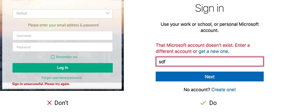
Error message should be helpful
It’s not enough to write that something went wrong. Show the users the way how to fix it as soon and easy as possible. For example, Microsoft describes what’s wrong and provides a solution in the error message so you can immediately fix this issue.
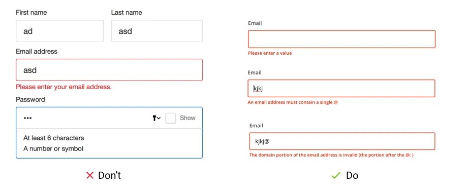
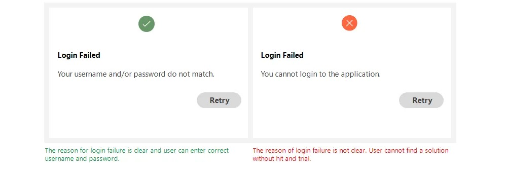
Error message should be specific to the situation
Very often websites use only one error message for all validation states. For example, you left this email field blank — “Enter a valid email address”, versus specifically you missed the “@” character — “Enter a valid email address”.
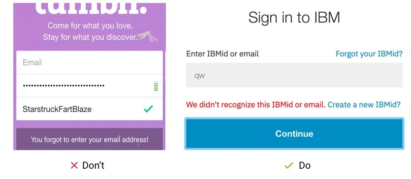
Don't blame the user
Always be polite and take the blame if your system is causing the error. And don’t blame your users that they did something wrong even if they did. Make users feel comfortable and convenient. It’s a great opportunity to use and prompt The Home Depot brand voice.
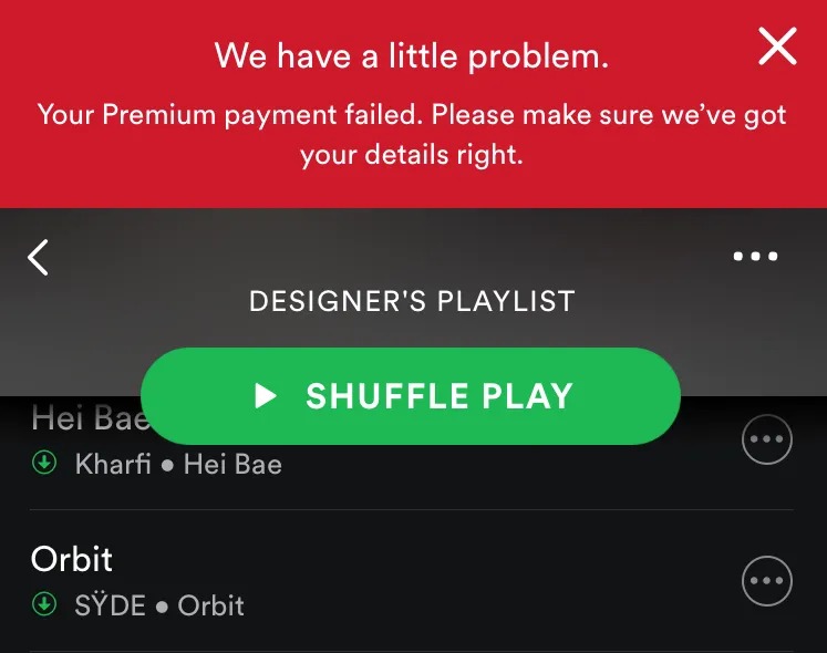
Be empathetic not an alarmist
Always explain the issue concisely without going into unnecessary detail: “Your payment has failed” might alarm someone. While providing clear instructions on what to do to fix the problem: “Please make sure we’ve got your details right” that shifts the tone to empathy and not blame.