Mastering Microcopy in Schwab Trader

Mastering microcopy is the key to creating a great user experience regardless of the platform. The rulebook for how to create consistent and transparent microcopy did not exist for Schwab Trader, so I was tasked with creating and sharing guided examples and tips I’ve learned from my years of developing app content.
MY KEY ROLE: Content Advocate and Content Creator
Your microcopy is the language used to communicate with the user, mostly likely your customer. It can make or break your product. So, it makes no sense at all to create or fix your copy right at the end of the UX/UI design process.
Therefore, one of my KEY ROLES is to advocate for a UX Content Designer/Writer to come in early and often to create app UX content.
UX writers need to be involved in the design process as early as possible. This helps writers communicate more effectively with the user. So, you can save the user’s time and prevent frustration.
ROLE OF MICROCOPY FOR an E2E Experience
Words help bridge the gap between the intention of the UX design and the reality of the user. Therefore, the role of microcopy is to give users an E2E experience that’s smooth and frictionless, something UX design cannot do entirely. That’s where words come in – they bridge the gap between what we want people to do, think, or understand vs. their current reality.
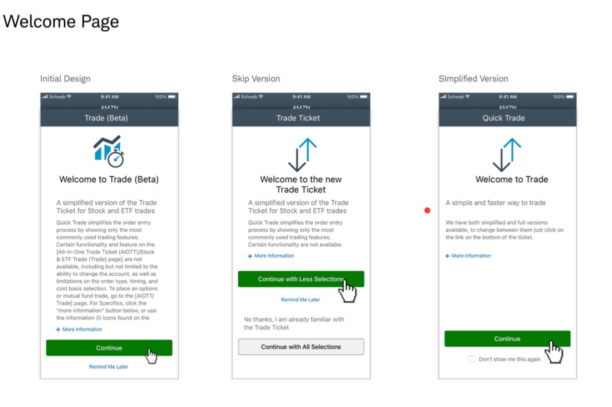
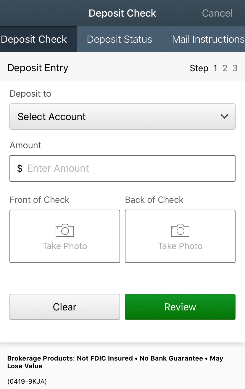
Microcopy in these Schwab Trading app screens makes it clear what the user is supposed to do. To get to this stage, I have made sure I identified and included actionable language in each step of the user journey, from the starting point to the endpoint. Steps in that journey that include the tools they will need, all use cases and potential unhappy paths.
MICROCOPY TIPS TO DRIVE USER ENGAGEMENT
Tip: Be Concise & Consistent
Your UX content needs to be short, meaningful, useful, and consistent. Pay attention to the labels, CTAs and microcopy you choose and make sure to use them throughout the E2E experience.
For example, if you select “Delete,” as your CTA use it whenever this action is meant to be done. Don’t change it for “remove” or any other synonym.
Tip: Use Short & Natural Language
Text content scannability is an important consideration when creating microcopy. Therefore, do your best to avoid long fragments. Write “Pay” instead of “Make a payment” or try “Buy” instead of “Purchase your stock,” for example.
Tip: Reduce Clutter
It is not necessary to display every possible information on the interface. Organize your content in a way that provides the user with a clear understanding of the available features. Reduce clutter and keep minimum content on the screen.
Tip: Strong Call-to-Action Buttons
Your content should include a call-to-action button. Your call-to-action button needs to be visible and clearly communicate the purpose of the action. This is why it is important to make your CTA buttons easily accessible and understandable. It is crucial to explain why your action will benefit the user.

Tip: Optimize Content Hierarchy
Do your best to present information in gradually and in the right order. It means designing to a content hierarchy with elements such as: Headlines, subheads, captions, and calls to action.
Ideally, microcopy should follow this hierarchy:
- The primary level. Headlines with core information.
- The secondary level. Subheads or captions, supporting scan-ability and
helping users navigate through text content. - The tertiary level. Body text and additional data, small yet readable.